#TheOnceUpon's Brand New Look
If you’re following us on Instagram, you may have noticed we’ve got a brand facelift since the new year started!
It was about a few months ago when our founder Tricia decided it was time to upgrade our brand image as the agency continues to grow. Through her brand marketing friends over at Olea & Fig, she learned about graphic designer Vivian Kammel’s work.
Fun Fact: The previous logo was hand-written by Annie Chang, the co-founder of Olea & Fig!
“I remember scrolling through Vivian’s website and then 5 minutes later, I’m writing her an email about wanting to work with her on designing Once Upon’s new logo and revamping the brand look,” Tricia told us; “I really loved the minimal aesthetics and the elegance of her work.”
Tricia wanted a design that reflects the brand character and values. Her goal was to allow people to relate to Once Upon upon the first sight of the logo.
“I thoroughly enjoyed the process of talking to Vivian when we first connected because I actually felt like I learned so much more about our brand during the conversation with her than I ever had. It was really refreshing to be able to communicate what we aim to offer at Once Upon to someone who needs to visualize it all and later turn it into a design.
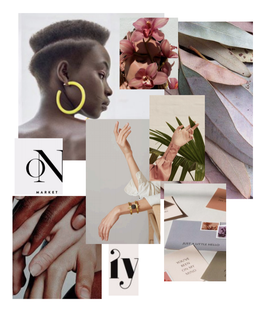
A mood board created by Vivian Kammel.
The Design Process
After understanding the brand better, Tricia and Vivian created a mood board that was put together to convey a sense of elegance, warmth and harmony. Tricia wanted a feminine and soft color palette that gives off calm and sophisticated characteristics, and Vivian flawlessly brought those elements to life.
When it came to the logo design itself and submarks, the idea was to keep everything clean and simple. Although we utilize a modern-day approach to marketing brands, the underlying idea is essentially getting their names on their via “word of mouth.” The only difference is doing it digitally via social media platforms. So with this in mind, Vivian “revamped” a classic font with a contemporary twist.
“Working on the Once Upon brand, our goal was to create a modern and unique brand that still felt extremely approachable and friendly,” Vivian explained, “we used a classic font that has been a favorite of international design houses, but added in unique aspects, particularly in the O and U, for a fresh look.”
Visualizing Once Upon as a Person
When Vivian was in the process of understanding the brand, she sent Tricia a questionnaire that required Tricia to really think about how she envisioned Once Upon to be. One section that Tricia remembered vividly was to write down adjectives describing the agency.
“I remember that part of the questionnaire really got me thinking: if Once Upon was a person or a friend, what would she be like,” Tricia recalled, “And in my mind, I imagine her to be friendly, easy to talk to, and open-minded.”
“If Once Upon was a person or a friend ... in my mind, I imagine her to be friendly, easy to talk to, and open-minded.””
We asked Vivian what she thought Once Upon would be like as an imaginary person, too.
“As a person, The Once Upon brand is a driven creative dreamer with a lot of passion and heart. She’s down to earth and approachable, but with a strong vision for what she wants,” Vivian told us.
“Working on the Once Upon brand, our goal was to create a modern and unique brand that still felt extremely approachable and friendly.”
About Vivian Kammel
Vivian is a graphic designer who focuses on creating heartfelt branding for conscious and creative businesses. For the past few years, she has worked with numerous ambitious creatives, including photographers, to help them gain clarity and develop a beautiful, yet smart brand.
You can visit Vivian’s website here: https://viviankammel.com/ or follow her on Instagram @viviankammel.
Photos: Courtesy of Vivian Kammel.
We hope you enjoyed reading our re-branding process. This year, we have new projects and plans lined up and we cannot wait to share more with you! Be sure to follow us @theonceupon to stay up to date for the latest happenings.
Thank you for stopping by our blog!
xoxo,
The Once Upon Team


